support materials
We created the branding and messaging for this project. The campaign was developed alongside the Whatcom County Health Department and included input from dozens of local organizations, including Western Washington University, Whatcom Tourism, multiple Chambers of Commerce, and dozens of local businesses. This project was early on in the COVID pandemic, and design and messaging around this topic was a learning process for everyone.
promoting the campaign
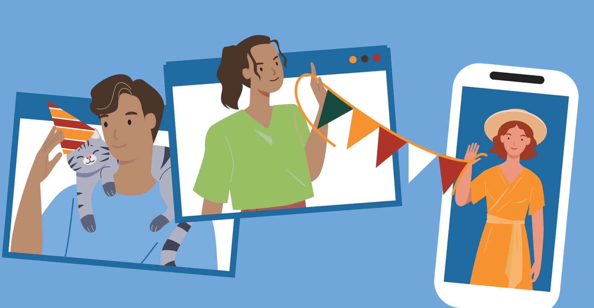
We developed social media assets, including images and messaging, and delivered them via an online spreadsheet that made it easy for the team to schedule and track posts. We also delivered a toolkit that allowed them to create new posts independently. Stakeholders were also encouraged to regularly share campaign-generated posts.
trust and reassurance
The Safer. Stronger. Together. palette was built around trust and reassurance — the two things businesses and their customers needed most during an uncertain time. Deep blues anchor the brand, drawing on long-established associations with reliability, calm, and authority. Warmer accent colors were layered in to soften that authority and reflect a sense of community and optimism. The goal was to communicate that reopening wasn’t just a policy directive — it was a shared effort.